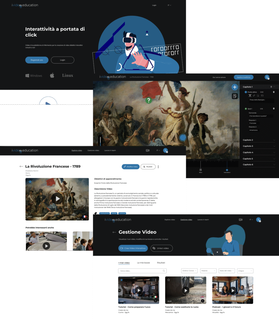
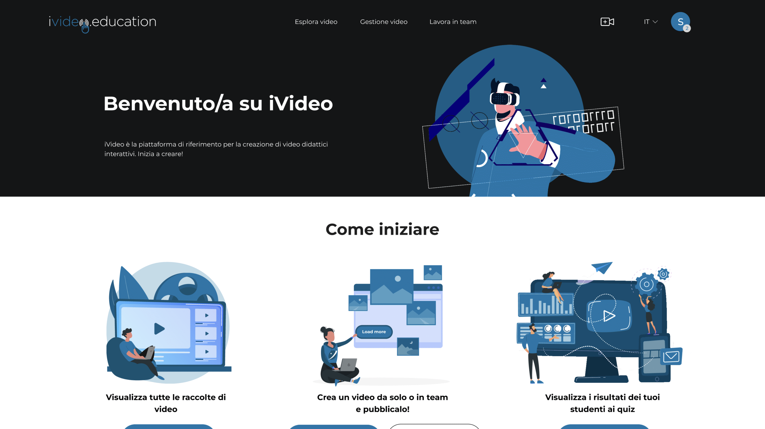
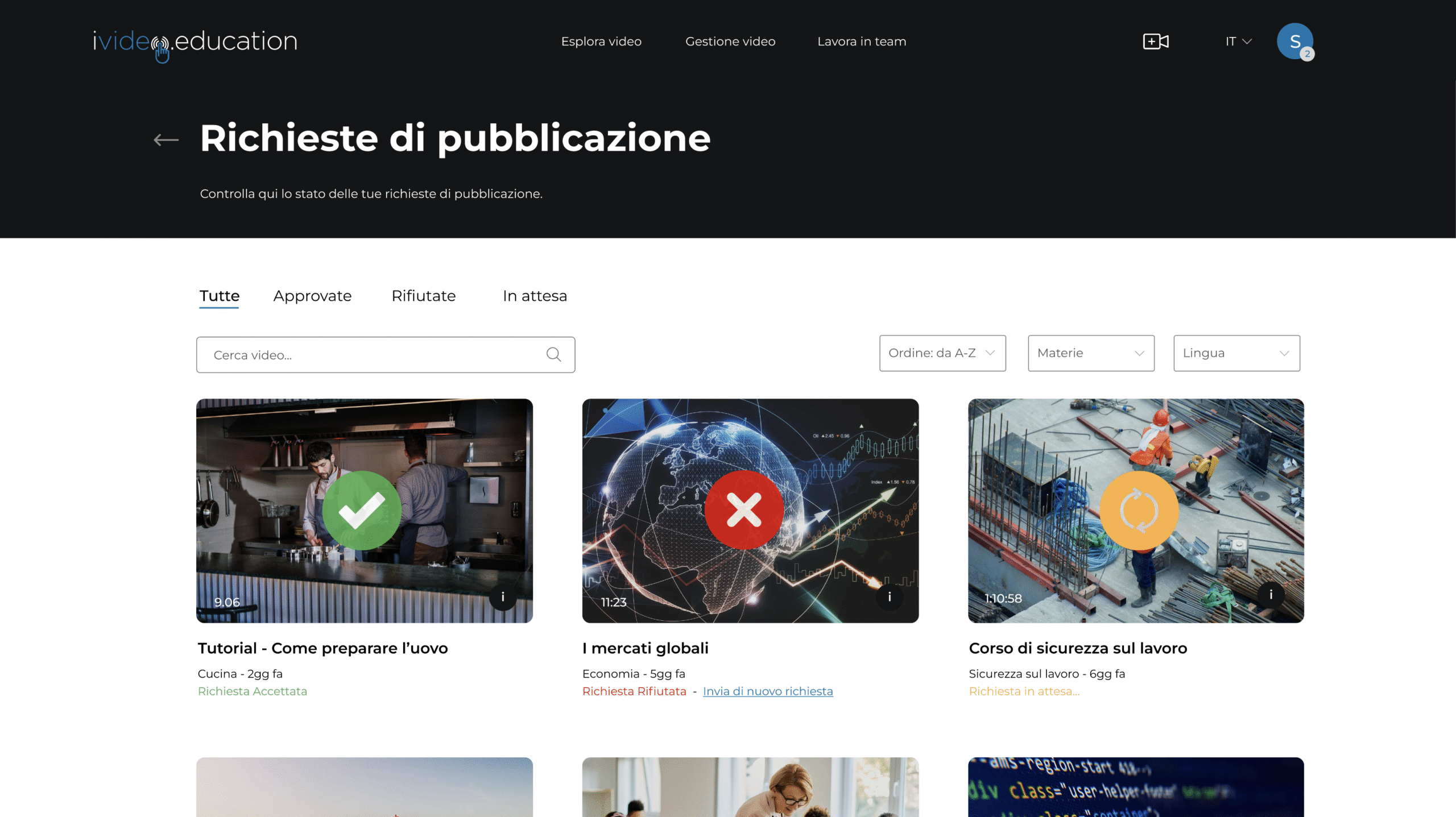
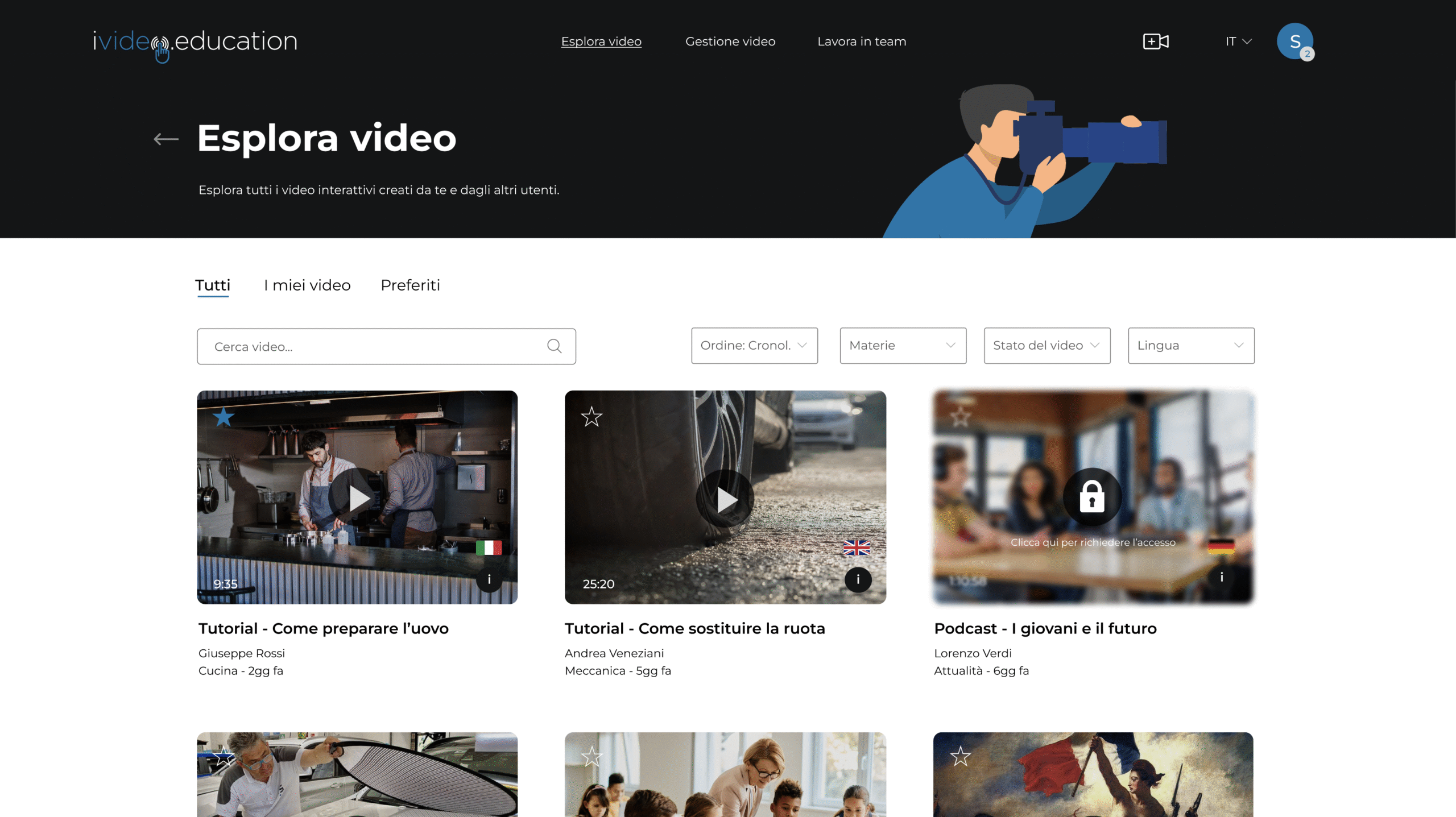
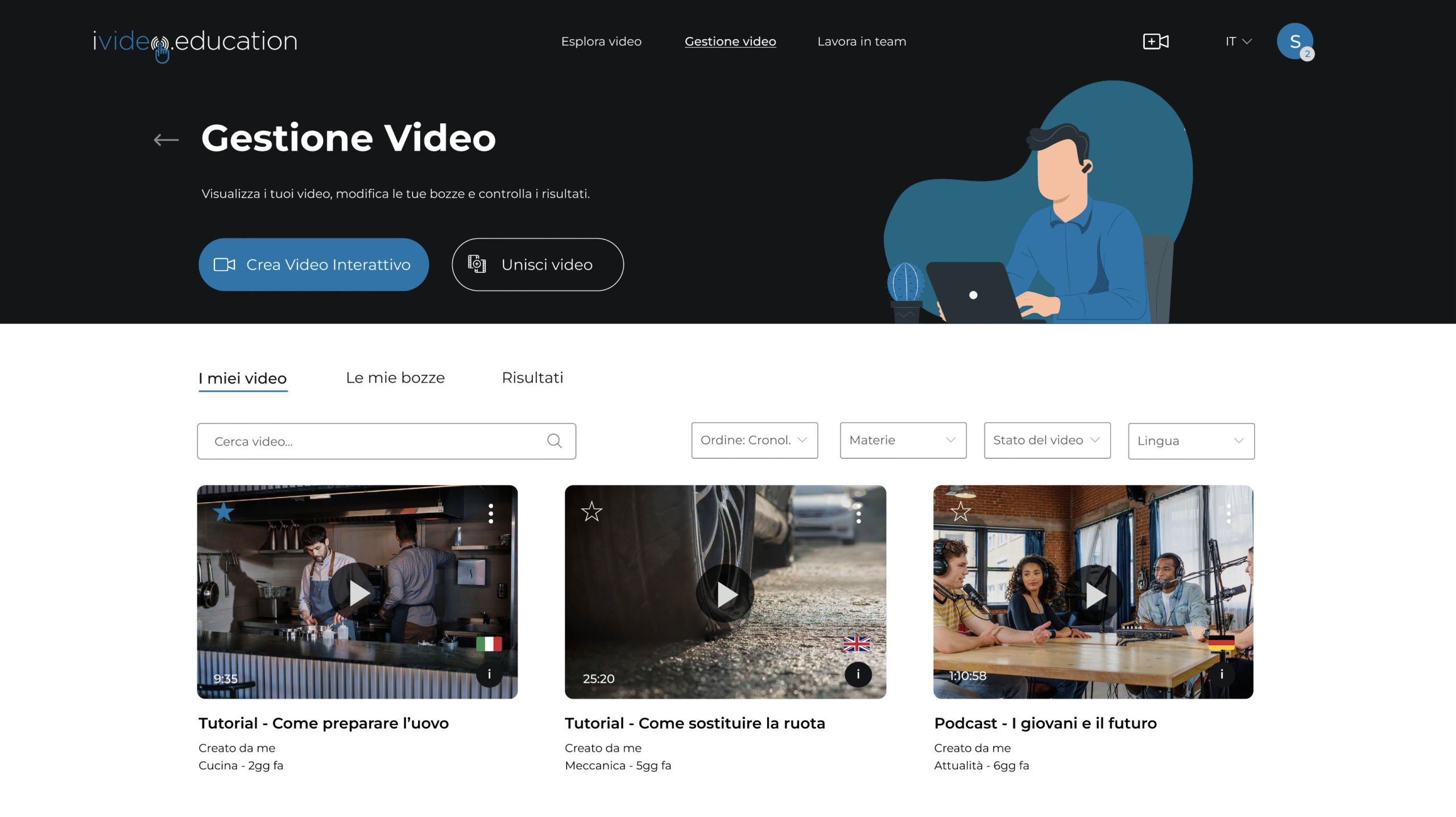
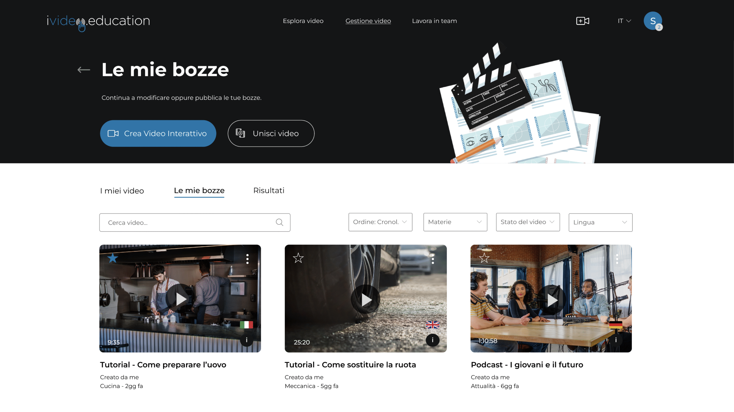
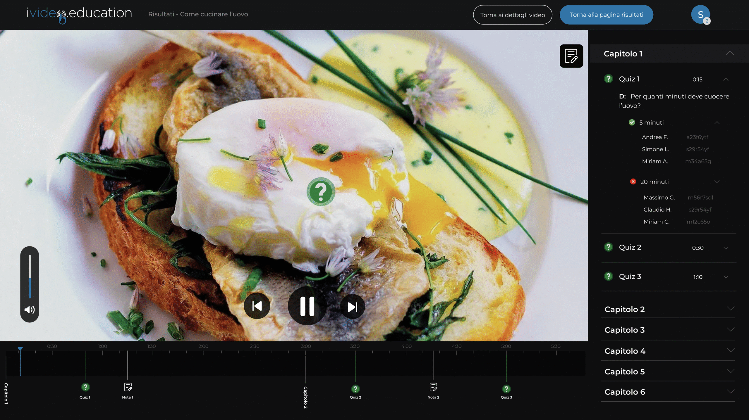
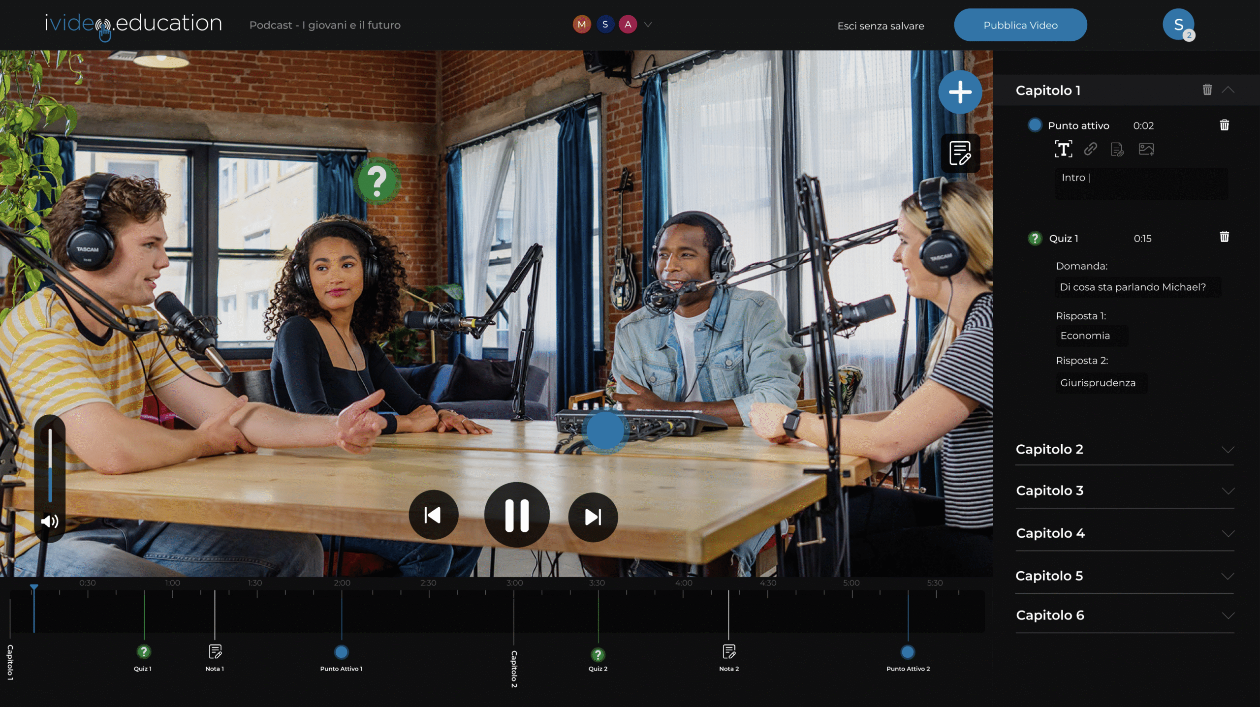
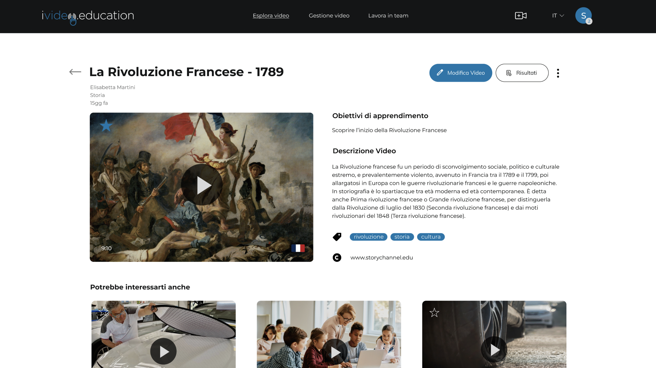
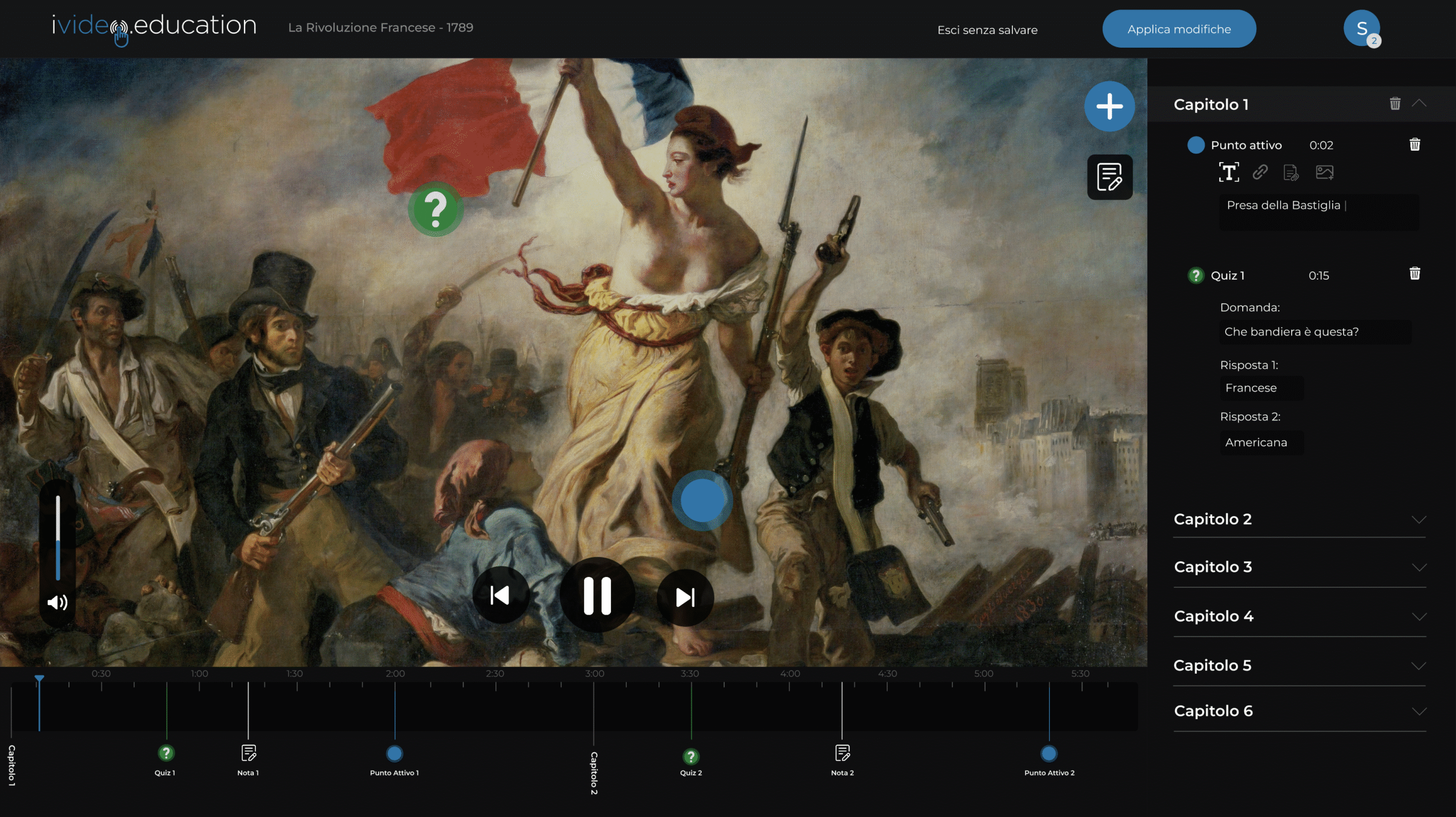
iVideo.Education is a platform designed for teachers and students of Swiss vocational schools. This platform uses “interactive points”, containing notes and notes from the teacher, to simplify student learning with the help of videos.
COLORS
Color Palette 🎨
The client already had a well-defined color palette, but for this redesign I decided to rethink it, giving it a more modern look:
#ffffff
#141516
#0276ac
abcdefghilmnopqrstu
abcdefghilmnopqrstu
abcdefghilmnopqrstu
abcdefghilmnopqrstu
FONT
Fonts Used 🔤
The font “Montserrat” was used for the platform.
PROJECT
Where I worked
This redesign was an individual work, where I tested my UI and UX skills for the last time in an academic setting, before entering the working world.
👥
Research Phase
Before starting the project, I interviewed potential users, performed functional benchmarking, and analyzed all the site's issues.
📱
Wireframe development
I was responsible for creating the UI and UX of the platform.
🤖
Prototyping
I took care of the prototyping of the product on Figma, so that it could be presented to the clients.