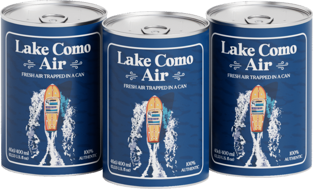
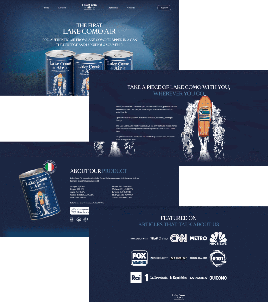
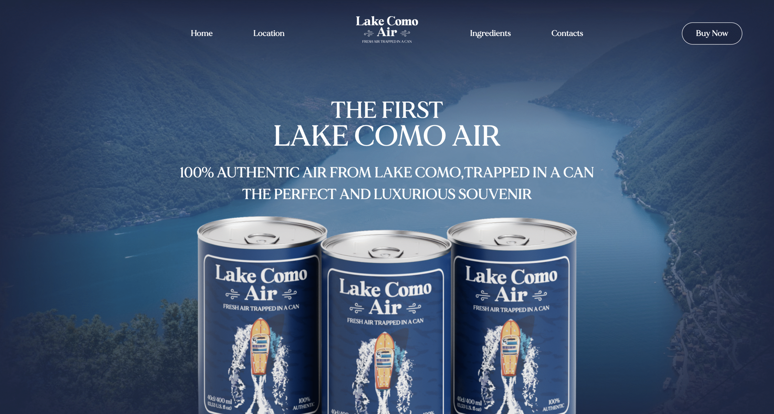
Lake Como Air is a jar containing the air of Lake Como. Born as a provocative souvenir, it has become a national and international phenomenon, so much so that it has been cited by CNN, BBC, Times, NBC News, Rai1, Corriere della Sera.
COLORS
Color Palette 🎨
For this project, a specific color palette was developed, which evoked a sense of cleanliness and freshness:
#ffffff
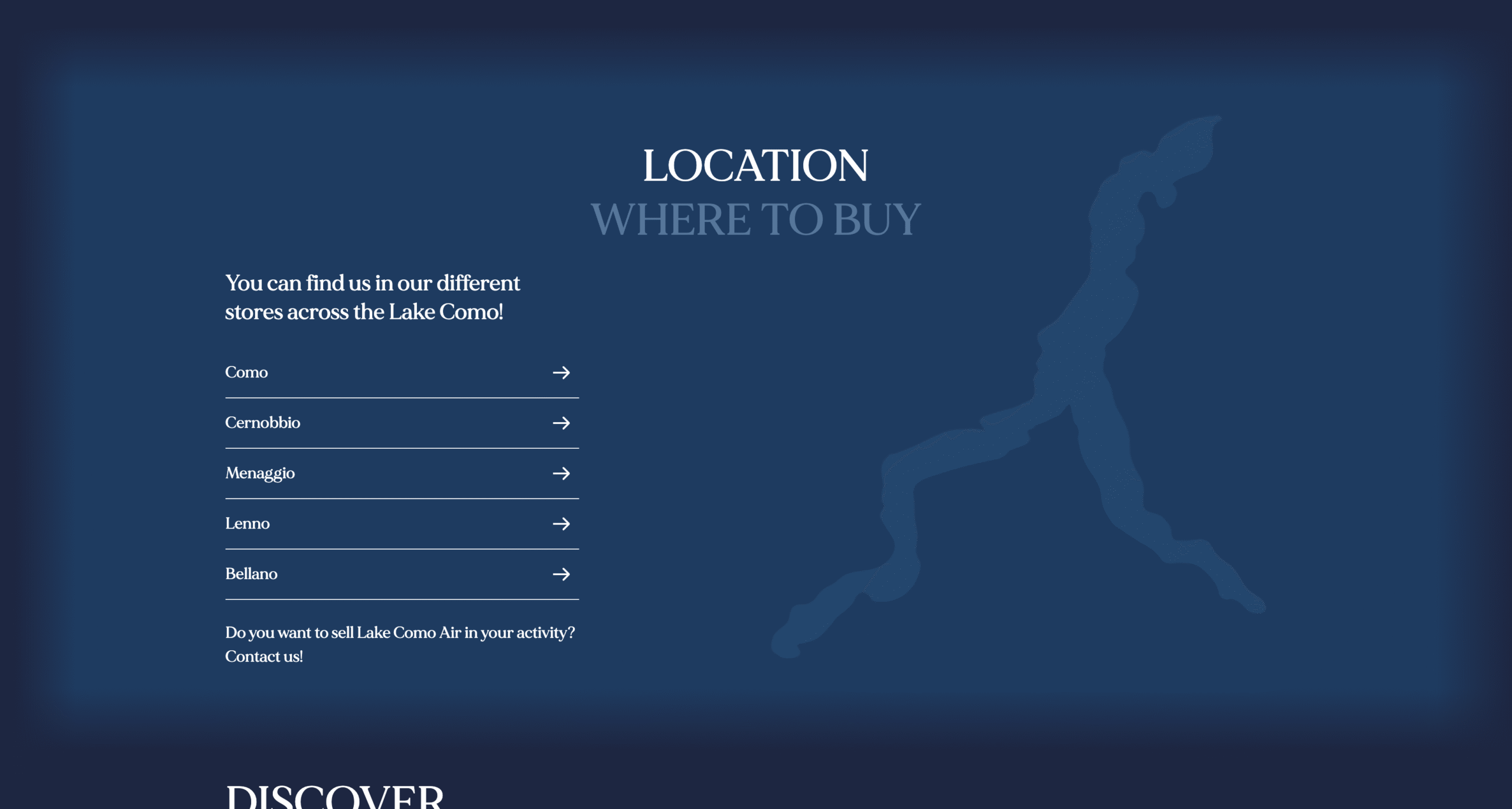
#1b2643
#113c63
abcdefghilmnopqrstu
abcdefghilmnopqrstu
abcdefghilmnopqrstu
FONT
Fonts Used 🔤
The font “MADE Mirage” was used for the website, which belongs to the Lake Como Air brand identity.
PROJECT
Where I worked
For this project, I worked by developing the mockup on Figma, defining Fonts and Palettes.
🖼️
Mockup development
I was in charge of developing the website mockup in Figma.
📱
UI Elements development
Creating custom UI elements, so as to have visual uniformity.